Sep 18, 2026Manufacturing Guide
Why Are Most Logos on Latex Resistance Bands Printed in White?
Learn why latex resistance bands usually use a single-color white logo, how screen-printing registration affects multi-color designs, and what buyers should confirm before bulk production.
Why Are Most Logos on Latex Resistance Bands Printed in White?
When buyers start a custom resistance band project, the logo often looks like the simplest part of the order. A brand may use two, three, or even more colors on its website and packaging, so it seems natural to print the same artwork on the band.
In mass production, however, most latex resistance bands use a single-color screen-printed logo—and white is by far the most common choice. This is not simply a design preference. It is mainly a practical decision based on the printing process, production consistency, and the appearance of the finished product.
Why Multi-Color Logos Are Difficult to Print Consistently
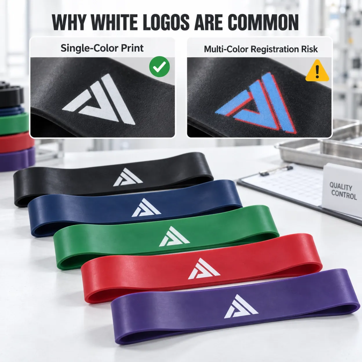
Latex resistance bands are normally printed by screen printing. A single-color logo requires one screen, one positioning step, and one printing pass.
A two-color logo requires a separate screen for each color and a repeated production sequence:
First color → Drying → Repositioning → Second color → Drying again
For three colors, the band must go through another round of positioning, printing, and drying.
The main problem is registration—the accurate alignment of each color. Latex bands are soft and elastic rather than rigid. Even a slight shift or stretch when the band is placed back onto the printing fixture can move the next color away from its intended position.
This may cause:
- visible gaps between colors;
- overlapping color edges;
- a blurred or doubled appearance;
- inconsistent logo positioning from one band to another;
- a higher rejection rate during inspection.
The more colors a logo contains, the more difficult it becomes to maintain the same result across hundreds or thousands of pieces. A multi-color sample may look acceptable, but repeating that result consistently throughout a bulk order is the real challenge.
Why White Is the Most Common Logo Color
Most latex resistance bands are made in strong or dark colors, such as black, navy blue, green, red, purple, and dark grey. White ink creates a clear contrast against these backgrounds, so the logo remains easy to read without requiring several colors.
White is also practical when one product set contains several band colors. The same white logo can be used across the whole resistance range, helping the collection look consistent while avoiding a separate logo-color decision for every band.
For buyers, this usually means:
- better visibility on dark and saturated band colors;
- a cleaner and more consistent brand appearance;
- easier quality control across different resistance levels;
- fewer printing defects in bulk production;
- more predictable production costs and lead times.
This is why white logos appear so often on pull-up bands, mini loop bands, therapy bands, and other latex fitness products.
Can Other Single Colors Be Printed?
Yes. White is common, but it is not the only option. Black, red, blue, yellow, silver, or another single logo color may be possible, depending on the band color and the type of ink available.
The key question is contrast. For example, a black logo can work well on a light pink or yellow band, but it may almost disappear on dark green or navy blue. A colored logo may also look different from one band color to another, even when the same ink is used.
Before confirming an alternative logo color, buyers should check:
- whether the logo is clearly visible on every band color;
- whether the selected ink can be reproduced consistently;
- whether a light ink needs additional passes on a dark band;
- whether the final appearance matches the brand’s packaging and product range.
What If the Brand Logo Is Multi-Color?
A multi-color brand identity does not have to be abandoned. In most projects, the more reliable solution is to create a one-color version of the logo for the resistance band and keep the full-color artwork for areas that are better suited to detailed printing.
The full-color logo can still be used on:
- retail boxes;
- carry bags;
- instruction cards;
- product inserts;
- barcode labels;
- online product images.
This approach keeps the band itself clean and durable while preserving the complete brand identity throughout the rest of the packaging.
Logo Artwork Recommendations for Buyers
For the best screen-printing result, supply a vector logo in AI, EPS, SVG, or editable PDF format. A simple design with solid shapes, clear spacing, and sufficiently thick lines is more suitable than artwork containing gradients, shadows, tiny text, or closely spaced details.
Before bulk production, confirm the following with the manufacturer:
- final logo size and printing position;
- band color and logo color combination;
- minimum line thickness and readable text size;
- whether a physical printed sample is required;
- the acceptable tolerance for logo placement and appearance.
A screen photo or digital mock-up can confirm the general layout, but a physical sample is more useful when exact color contrast and print clarity matter.
The Practical Choice for Bulk Orders
For most custom latex resistance band orders, a single-color logo provides the best balance between appearance, durability, production consistency, cost, and lead time. White is selected most often because it remains clear on many popular band colors and allows an entire resistance set to share one consistent visual style.
Multi-color printing may be discussed for certain designs or order quantities, but buyers should expect additional screens, repeated positioning, longer production time, higher cost, and a greater risk of registration defects. For stable bulk production, a simplified one-color logo is usually the safer specification.
FAQ
Can you print a two-color logo on latex resistance bands?
It may be technically possible for some simple designs, but each color requires a separate screen and printing pass. Because the band must be repositioned, the risk of color misalignment and inconsistent bulk results is higher.
Why do manufacturers recommend a white logo?
White provides strong contrast on most dark or saturated resistance band colors. It is clear, easy to inspect, and can be used consistently across a multi-color resistance set.
Is a black logo suitable for resistance bands?
Yes, especially on light-colored bands. It is less suitable for black, navy, dark green, or other deep colors because the contrast may be too low.
Can the full-color logo be used on the packaging instead?
Yes. Many brands use a single-color logo on the band and place the complete multi-color artwork on the box, bag, instruction card, or product label.
Do you recommend approving a printed sample before production?
Yes, particularly when the logo contains small details or when the buyer selects a color other than white. A printed sample helps confirm clarity, contrast, size, and positioning before mass production.